Our work explores the joy of revelation: the special electricity of seeing a city from the air, of hearing a secret, of watching a lover undress.
Our medium is data visualization, a technology developed by computer scientists to extract insights from raw numbers. This technique is ideal for investigating a world represented by digital traces, where truth is hidden in masses of information. The resulting studies take the form of websites, prints, and videos.
At the same time, our artwork complicates and subverts a tool that is largely used by the business and military elite. Unlike these traditional uses, we believe visualization to be an expressive medium that invites emotion. We aim our tools at data sets that range from hip hop songs to Walt Whitman's poetry, from arguments on Wikipedia to expressions of carnal desire. We strive to expand the practical craft of visualization beyond function to create objects of social engagement, pleasure and revelation.
Our process is driven by curiosity and a sense of adventure. Data is the starting point, followed by incessant questioning, with a touch of wonderment and laughter. Eventually we start to ask questions that can't be answered by direct observation. At that point we begin to work in software code, creating a series of digital instruments, telescopes and microscopes of the abstract world that reveal more than our own eyes can see.
As proponents of expressive visualization, we exploit the power of color and complexity to reveal arresting, unintuitive patterns. Parallel to depth of information, clarity and interactivity are of great concern to us. We strive to build intelligible visualizations that engage viewers at a formal level while allowing them to hold a dialogue with the underlying data. It is in this dialogue, we hope, that the brightest sparks of revelation will be found.
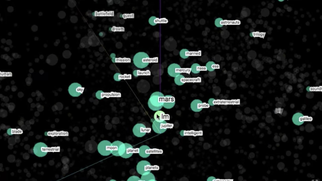
A) Embedding Projector: an open source, visualization tool for high-dimensional data
This experiment gives you a peek into how machine learning works, by visualizing high-dimensional data. It's available for anyone to try on the web. It is also open-sourced as part of TensorFlow, so that coders can use these visualization techniques to explore their own data. Embedding Project featured below is joint projects at Google.


Built by Daniel Smilkov, Fernanda Viégas, Martin Wattenberg, and the Big Picture team at Google.
Embedding Projector (Daniel Smilkov, Nikhil Thorat, Emily Reif, Charles Nicholson)
B) Wind map: A real-time map of the wind in the U.S.
An invisible, ancient source of energy surrounds us—energy that powered the first explorations of the world, and that may be a key to the future. The wind map shows the delicate tracery of wind flowing over the US.
The map was created in the cold winter months when wind was much on our minds. It conveys the movement of the air in the most basic way: with visual motion. As an artwork that reflects the real-world, its emotional meaning changes from day to day. On calm days it can be a soothing meditation on the environment; during hurricanes it can become ominous and frightening.

Although we made the wind map as an artistic exploration, we've been surprised by the kinds of things people use it for: bird watchers have tracked migration patterns; bicyclists have planned their trips; and we've even seen conspiracy theorists use it to track mysterious chemicals in the air. Even on a day of mild weather, patterns can be dramatic. There's much more to the wind than a west to east flow.


Hurricane Isaac (August 29, 2012)
About the data: Surface wind data comes from the National Digital Forecast Database. These are near-term forecasts, revised once per hour.
About the technique: The general technique of using comet-like trails to show motion goes back to Edmund Halley in 1686 (see Fowler & Ware). Many scientists (Fowler & Ware, Jones & Saito, van Wijk, etc.) have described variations during the past few decades. Our map is designed to provide a dense, easily readable field and to highlight areas of high wind speed. It's implemented entirely in HTML and JavaScript.
More info here.
C) TensorFlow Playground: an open source, transparent neural net you can play in your browser
TensorFlow Playground is a joint project at Google (Daniel Smilkov, Shan Carter, D. Sculley)
D) Unfiltered News: news coverage around the world (a collaboration with Jigsaw and others)
E) History Flow: Conflict and cooperation on Wikipedia.
In 2003, we decided to investigate the dynamics behind editing in Wikipedia. History flow is the method we invented to make sense of the data we collected.

History Flow - Chocolate
The colorful history flow diagrams take a lengthy edit history and turn it into a picture. The image above, for instance, shows the history of the Wikipedia article on chocolate. What jumps out? The zigzag pattern at the right. It turns out that this is an argument over whether a certain type of surrealist sculpture exists or not. (For details of the visualization technique, see the IBM project page.)
The first image below is the diagram for the article on abortion. The black gashes show points where the article has been deleted and replaced with offensive comments. This type of vandalism turns out to be common on controversial articles.

History Flow - Abortion
History flow diagrams helped us understand Wikipedia in 2003 when it was very young. (Our 2004 CHI paper was the first computer science publication analyzing the online encyclopedia.) Since then, the site has grown enormously and the dynamics have become even more complex.
Related academic papers
Studying Cooperation and Conflict between Authors with history flow Visualizations Fernanda B. Viégas, Martin Wattenberg, and Kushal Dave. CHI 2004.
Talk Before You Type: Coordination in Wikipedia.
Fernanda B. Viégas, Martin Wattenberg, Jesse Kriss, Frank van Ham. HICSS-40, 2007.
More info here.
F) Flickr Flow: Visualize the seasons changing
Flickr Flow is an experiment whose materials are color and time. We first used this technique in a Boston Magazine piece, Flickr of Hope, that appeared in March 2009.


The two of us see the world as a stream of color, and in 2009 we finally had a chance to draw the river in our heads. We began with a collection of photographs of the Boston Common taken from Flickr. Using an algorithm developed for the WIRED Anniversary visualization, our software calculated the relative proportions of different colors seen in photos taken in each month of the year, and plotted them on a wheel. The image below is an early sketch from the piece. Summer is at the top, with time proceeding clockwise.
More info here
G) Attacking discrimination with smarter machine learning: educational article.
As machine learning is increasingly used to make important decisions across core social domains, the work of ensuring that these decisions aren't discriminatory becomes crucial.
Here we discuss "threshold classifiers," a part of some machine learning systems that is critical to issues of discrimination. A threshold classifier essentially makes a yes/no decision, putting things in one category or another. We look at how these classifiers work, ways they can potentially be unfair, and how you might turn an unfair classifier into a fairer one. As an illustrative example, we focus on loan granting scenarios where a bank may grant or deny a loan based on a single, automatically computed number such as a credit score.
About Authors
Google research site | Joint personal site.
Fernanda Viégas and Martin Wattenberg are pioneers in data visualization and analytics. Their research has helped shape the field, and the systems they've built are used daily by millions of people.
As leaders of Google's data visualization research group, they focus on finding new ways for users to understand and explore data. Their team's work has appeared on the Google search page, on YouTube, and in mission-critical internal data analytics tools.
Before joining Google, the two founded Flowing Media, Inc., which focused on media and consumer-oriented projects. Prior to Flowing Media, they led IBM's Visual Communication Lab, where they created the ground-breaking public visualization platform Many Eyes, which introduced visualization to millions of users worldwide. The two became a team in 2003 when they performed the first scientific study of Wikipedia, leading to the "history flow" project that revealed the self-healing nature of the online encyclopedia.
Viégas was named one of the most influential women in technology by Fast Company. Her visualizations of email and online conversation led the way for new social media interfaces. Wattenberg, as a director of R&D at Dow Jones, created some of the first digital journalism technology. His visualization of the stock market and baby names are considered Internet classics.
Viégas and Wattenberg are also known for visualization-based artwork, which has been exhibited in venues such as the Museum of Modern Art in New York, London Institute of Contemporary Arts and the Whitney Museum of American Art. Their artwork has influenced contemporary design practice: for instance, the techniques in their wind map are now used by many major media companies to display the weather.
Thes works featured in this Spotlight with corresponding descriptions can be found at hint.fm